ICU Deterioration Warning System
completeBuilt an ICU early deterioration warning system on 110M+ hourly records from 50,920 patients (MIMIC-IV), using XGBoost with 12-hour rolling window features to predict vasopressor initiation, intubation, CRRT, or death within 12 hours
ICU Early Deterioration Warning System
The Problem
In the ICU, deterioration rarely announces itself. A patient who looks stable at 2 AM may be intubated by 6 AM. Clinical staff are stretched thin, monitoring dozens of patients simultaneously. Standard severity scores like SOFA are computed once a day — far too coarse to catch a patient sliding toward crisis.
The goal: produce a continuous, per-hour risk score for every ICU patient that answers the question:
In the next 12 hours, will this patient die, require vasopressors, be intubated, or need dialysis?
A model that flags deterioration hours in advance gives clinical teams a window to intervene.
Dataset — MIMIC-IV
| Source | MIMIC-IV (Beth Israel Deaconess Medical Center, 2008–2019) |
| ICU stays | 50,920 patients |
| Hourly records | ~110 million rows |
| Uncompressed size | 27.9 GB |
| Median stay length | 44 hours |
| 90th percentile stay | 171 hours |
| Mortality rate | 17.7% |
| Composite deterioration rate | 52.5% |
Composite Outcome (what we're predicting)
The label fires if any of the following occur within the next 12 hours:
| Event | Prevalence |
|---|---|
| Death | 17.7% |
| New vasopressor initiation | 32.0% |
| New invasive ventilation | 35.5% |
| New CRRT (dialysis) | 2.2% |
Each of these represents an irreversible escalation in care. Predicting them individually would be too sparse; combining them creates a clinically coherent composite with meaningful prevalence.
Pipeline
BigQuery (110M rows)
│
â–¼
SQL Window Functions
┌─────────────────────────────────────────────â”
│ 12-hour rolling stats per patient-hour │
│ (mean, std, min, max, last, missing-frac) │
└─────────────────────────────────────────────┘
│
â–¼
Download feature matrix (~27 MB parquet)
│
â–¼
Python: derived interaction features
(SpO2/FiO2, pulse pressure, shock index,
pH×pCO2, GCS delta)
│
â–¼
Patient-level stratified split
(70% train / 15% val / 15% test — no row leakage)
│
â–¼
XGBoost training with early stopping
(AUPRC on validation set)
│
├──► SHAP TreeExplainer
│ (global importance + per-prediction waterfall)
│
├──► Threshold optimization
│ (F-beta β=1.5, recall-prioritized)
│
└──► Serialized artifacts
(model JSON + feature list + encoders)
Feature Engineering
Features are computed as rolling statistics over a 12-hour lookback window — capturing not just where a patient is, but where they've been trending.
| Group | Variables | Statistics |
|---|---|---|
| Vitals (10) | Heart rate, SpO2, SBP/DBP/MAP, temperature, glucose | last, mean, std, min, max, missing% |
| Blood gases (5) | pH, pCO2, pO2, bicarbonate, SaO2 | last, mean, std, min, max, missing% |
| Ventilator (13) | RR, PEEP, FiO2, tidal volume, peak pressure, I:E ratio | last, mean, std, min, max, missing% |
| Interventions (2) | Vasopressor on/off, CRRT on/off | last, std |
| Clinical scores (7) | GCS (total + components), SOFA, Sepsis-3 | last, mean, std |
| Derived | SpO2/FiO2, pulse pressure, shock index, pH×pCO2, ΔGCS | — |
| Static | Age, sex, race, ICU unit type, Elixhauser comorbidity score, height | — |
Total: 212 features (v2, after SHAP-guided pruning from 245 in v1)
Why missingness is a feature
For labs like blood gases, whether a value was measured is itself clinical signal — these tests are ordered when a clinician already suspects something is wrong. A blood gas drawn at 3 AM is not random.
Results
Test Set Performance
| Metric | Value |
|---|---|
| AUROC | 0.995 |
| AUPRC | 0.387 |
| Optimal threshold (F-β, β=1.5) | 0.743 |
AUROC near 1.0 shows the model separates deteriorating from stable patients with high confidence. AUPRC of 0.387 is the harder metric — it accounts for class imbalance and is the standard for clinical early-warning models. A random classifier scores AUPRC equal to prevalence (~0.05 at the hourly level), so 0.387 represents a large lift.
ROC · Precision-Recall · Calibration
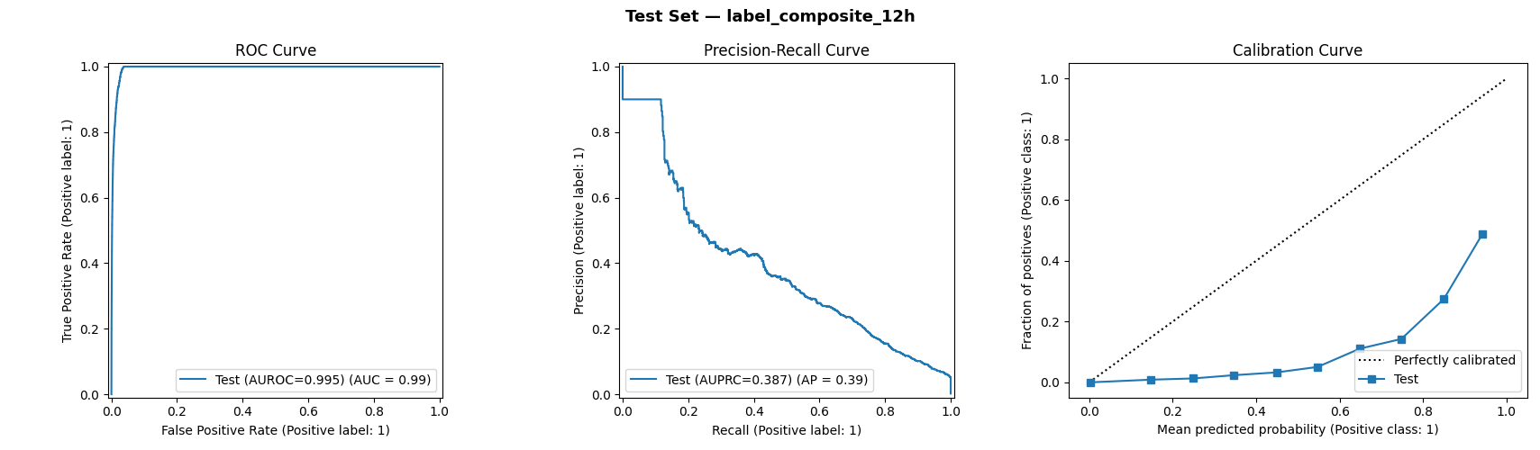
The ROC curve (left) hugs the top-left corner — near-perfect discrimination. The precision-recall curve (center) shows how the model maintains high precision at low recall thresholds, then gracefully trades precision for recall as the threshold drops. The calibration curve (right) shows the model is underconfident at high probabilities — predictions near 0.9 correspond to an actual positive rate of ~0.5 — worth noting for clinical deployment.
Threshold Selection
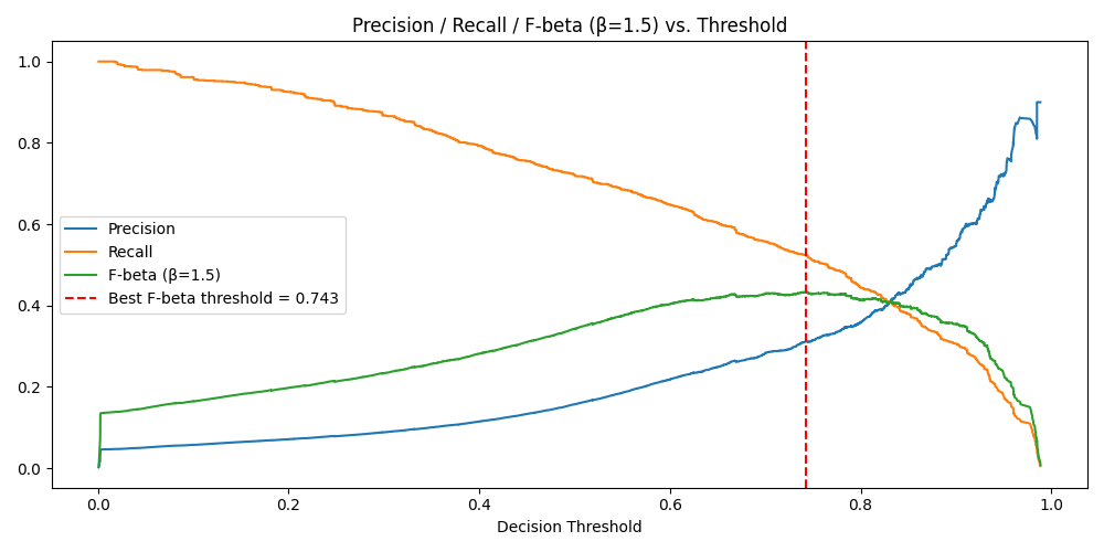
In ICU alerting, missing a deteriorating patient (false negative) is far worse than an unnecessary alarm (false positive). The threshold was optimized using F-beta with β=1.5, which weights recall 1.5× over precision. The optimal threshold lands at 0.743 — conservative enough to catch most true positives without drowning nurses in false alerts.
Model Explainability — SHAP
XGBoost was chosen in part because SHAP TreeExplainer computes exact (not sampled) Shapley values, making every prediction auditable. This matters in clinical settings: a model that says "high risk" but can't explain why is difficult to act on.
Global Feature Importance
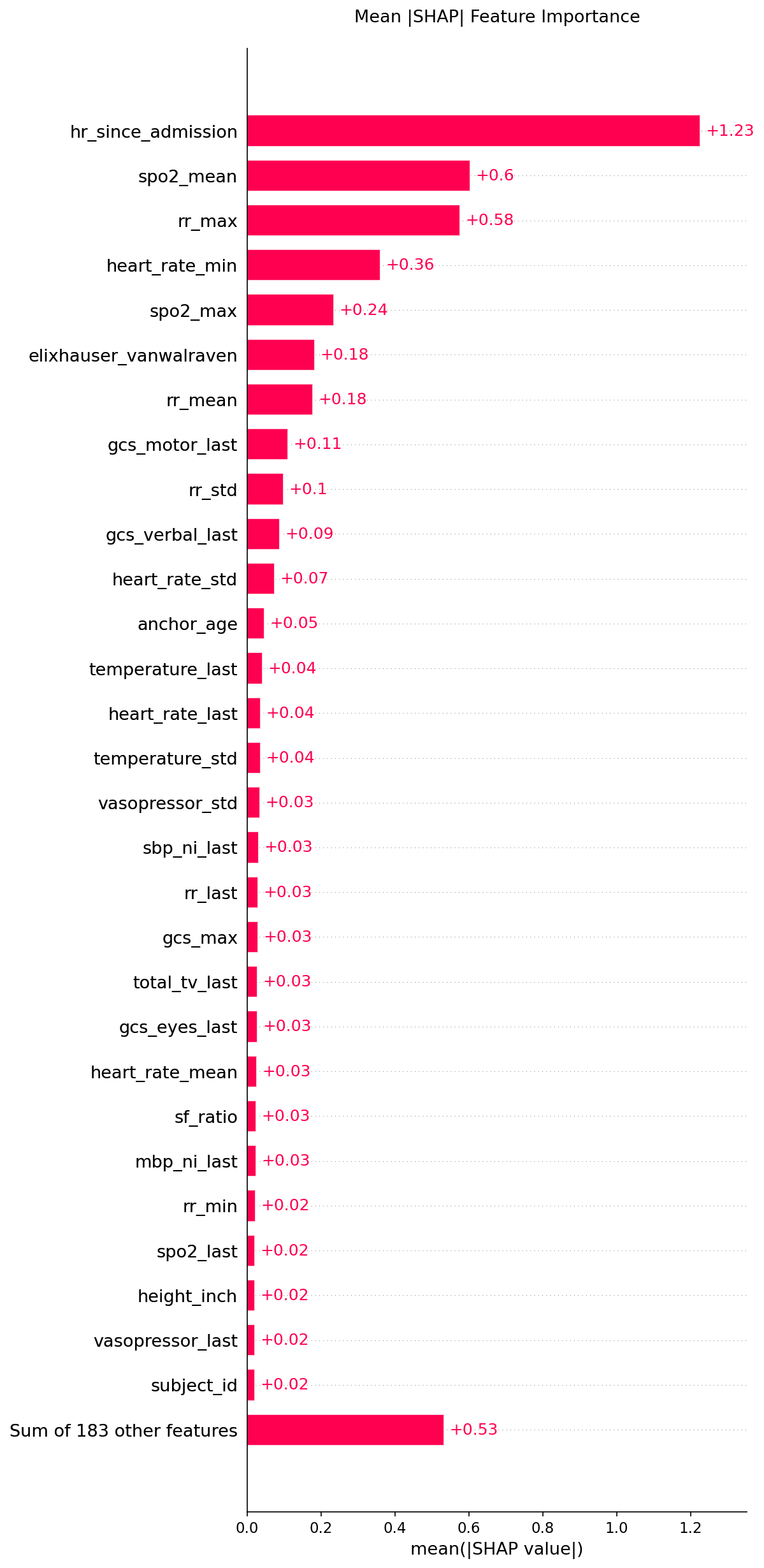
The top drivers of deterioration risk:
| Feature | Mean abs SHAP | Clinical meaning |
|---|---|---|
hr_since_admission | 1.23 | Longer ICU stays → sicker, more complex patients |
spo2_mean | 0.60 | Average oxygen saturation over 12h — oxygenation trend |
rr_max | 0.58 | Peak respiratory rate — respiratory distress signal |
heart_rate_min | 0.36 | Minimum HR — bradycardia can signal shock or sedation |
spo2_max | 0.24 | Ceiling SpO2 — helps distinguish transient vs. sustained desaturation |
elixhauser_vanwalraven | 0.18 | Comorbidity burden — baseline frailty |
Direction & Distribution — Beeswarm
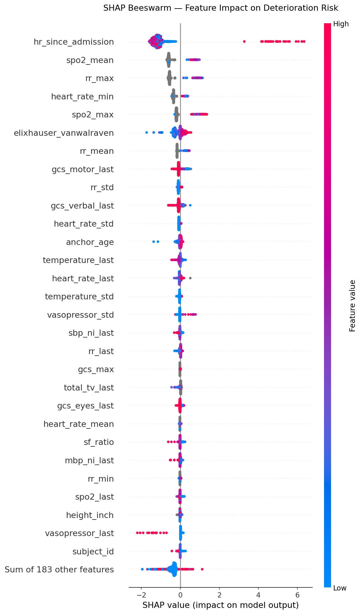
Each dot is one patient-hour. Red = high feature value, blue = low. The x-axis shows how much that feature pushed the prediction toward risk (right) or safety (left).
- High
hr_since_admission(red, far right) — very long stays strongly increase risk - High
spo2_mean(red, left) — good oxygenation reduces risk - High
rr_max(red, right) — fast breathing increases risk - High
heart_rate_min(red, left) — strong baseline HR actually slightly reduces risk (bradycardia is the red flag)
Single-Patient Explanation — Waterfall
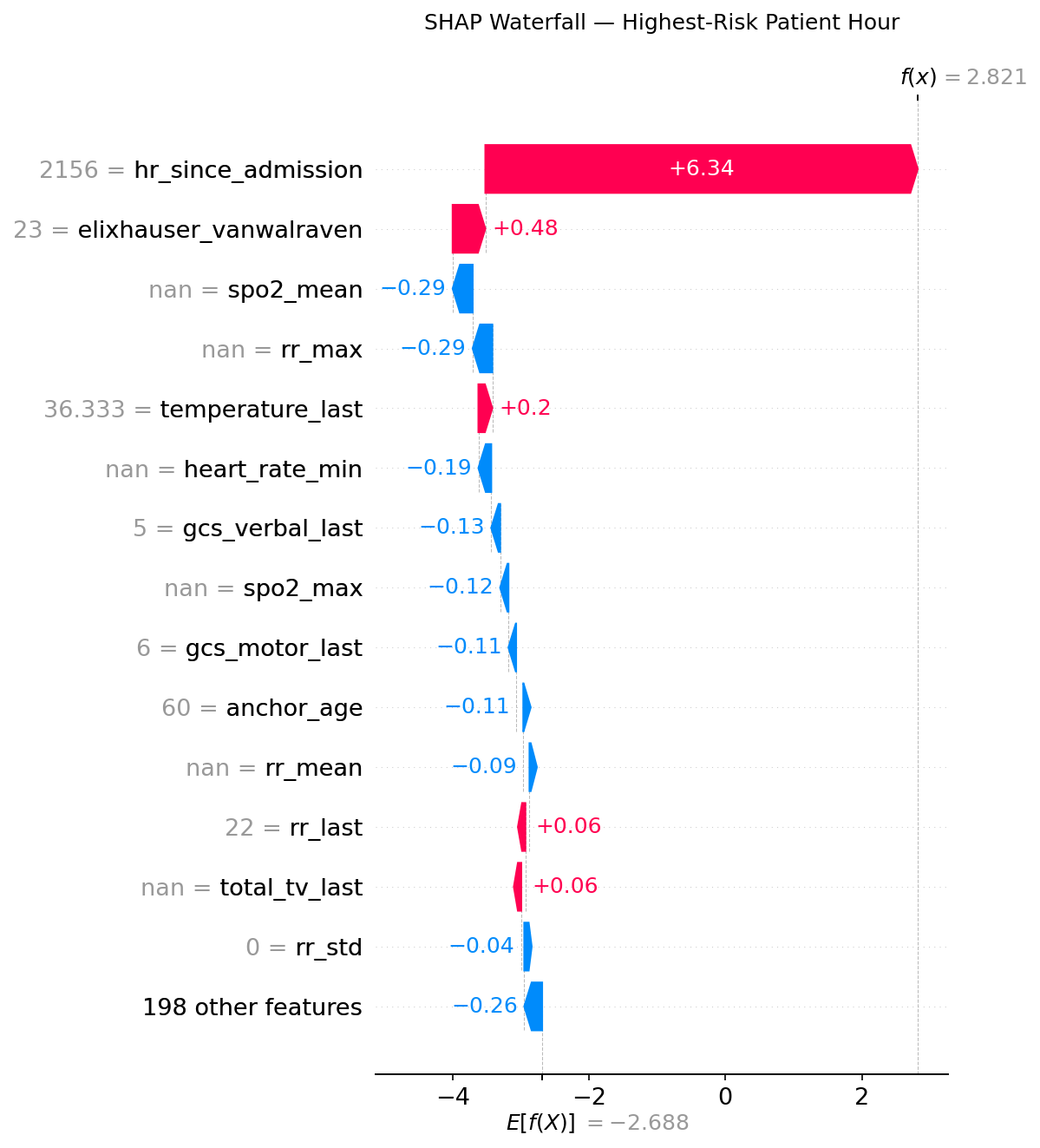
This is the model's reasoning for the single highest-risk prediction in the test set (f(x) = 2.821, well above the 0.743 threshold). The baseline expected value is −2.688.
hr_since_admission = 2156pushes risk up by +6.34 — this patient has been in the ICU for nearly 90 dayselixhauser_vanwalraven = 23adds +0.48 — high comorbidity burden- SpO2 and RR features (NaN = not measured during this window) slightly reduce the score — absence of recent measurements here dampens the signal
- Despite those offsets, the ICU tenure alone is enough to produce a very high-risk prediction
This level of transparency is what makes the model usable in clinical practice: a nurse can see why an alert fired, not just that it did.
Model Iteration: v1 → v2
| Version 1 | Version 2 | |
|---|---|---|
| Training date | May 3, 2026 | May 4, 2026 |
| Features | 245 | 212 (−14%) |
| Validation AUPRC | 0.3950 | 0.3924 |
| What changed | Full feature set | Removed low-SHAP vital-sign missingness flags |
| Model size | 786 KB | 826 KB |
| Key insight | Baseline | Missing-value indicators for heart rate, temperature, blood pressure carry near-zero SHAP — clinical intuition confirms these vitals are almost always recorded |
The v1→v2 transition was driven by SHAP analysis, not guesswork. Removing 33 features caused a 0.3% AUPRC drop — within noise — while making the model more parsimonious, faster at inference, and easier to explain to clinicians.
Technical Stack
| Layer | Tool |
|---|---|
| Data warehouse | Google BigQuery |
| Feature engineering | BigQuery SQL window functions + Python pandas |
| Model | XGBoost (GPU-accelerated, CUDA) |
| Explainability | SHAP TreeExplainer (exact values) |
| Evaluation | scikit-learn (AUROC, AUPRC, Brier score) |
| Serialization | XGBoost JSON + joblib |
| Visualization | matplotlib, seaborn |
Limitations & Honest Caveats
- Single-center data. MIMIC-IV is from one Boston hospital. Generalization to other health systems requires external validation.
- Calibration gap. The model is underconfident at high probabilities — raw scores should not be interpreted as literal probabilities without recalibration.
- No prospective validation. Performance on retrospective held-out data is not the same as real-world deployment. A prospective trial would be the next step.
- Composite label obscures subtype. A patient about to be intubated and one about to start vasopressors look different clinically but get the same label. Outcome-specific sub-models may improve actionability.